Slide or Survive - Mapping Avalanche Risk
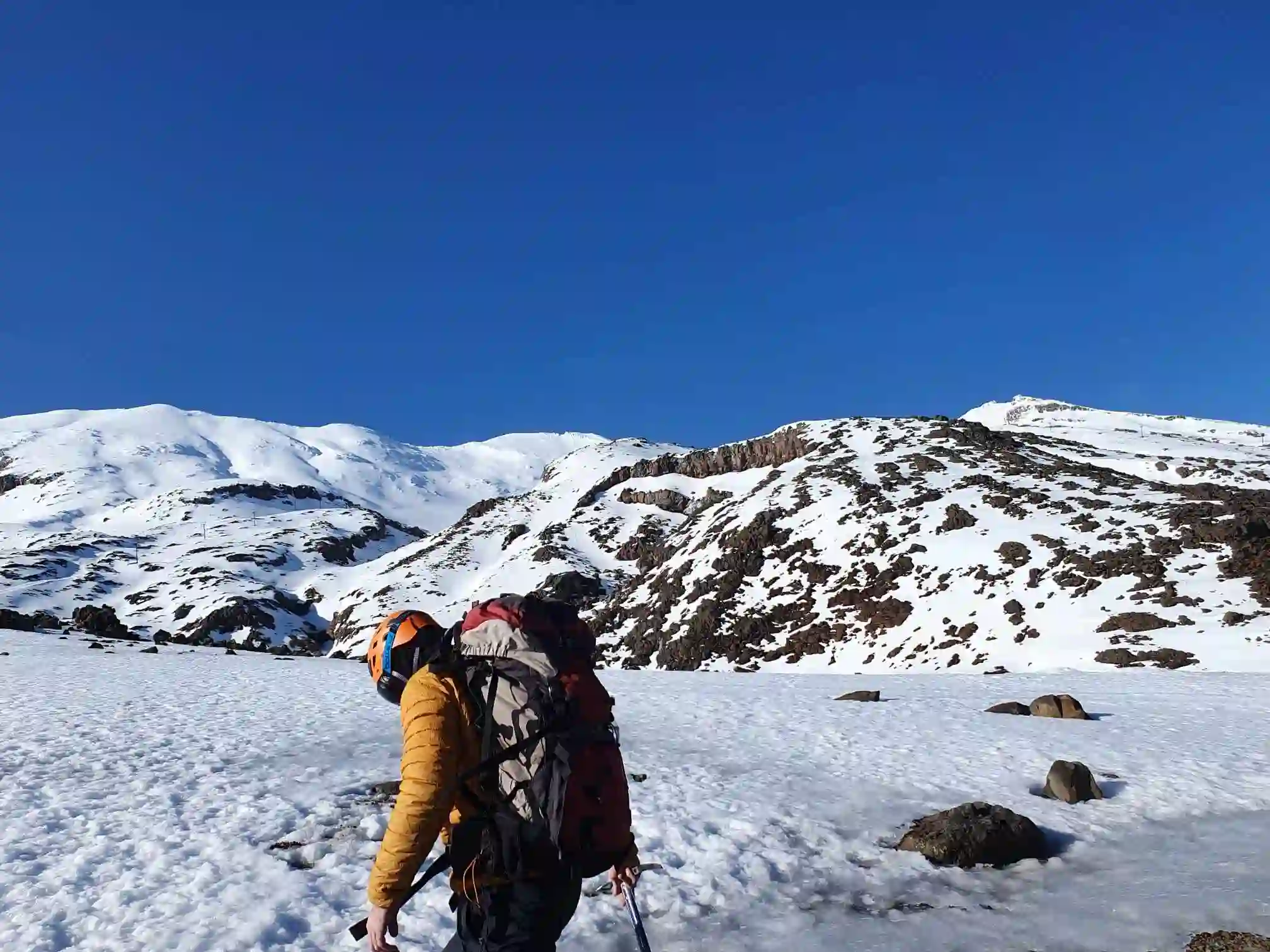
Mountaineering is dangerous. After dipping my toes into a bit of ‘danger walking’ last year through an alpine safety and snowcraft course, i came away with a feeling that it was potentially at the limit of risk tolerance. It can be very safe, but people unfortunately die all the time in NZ.
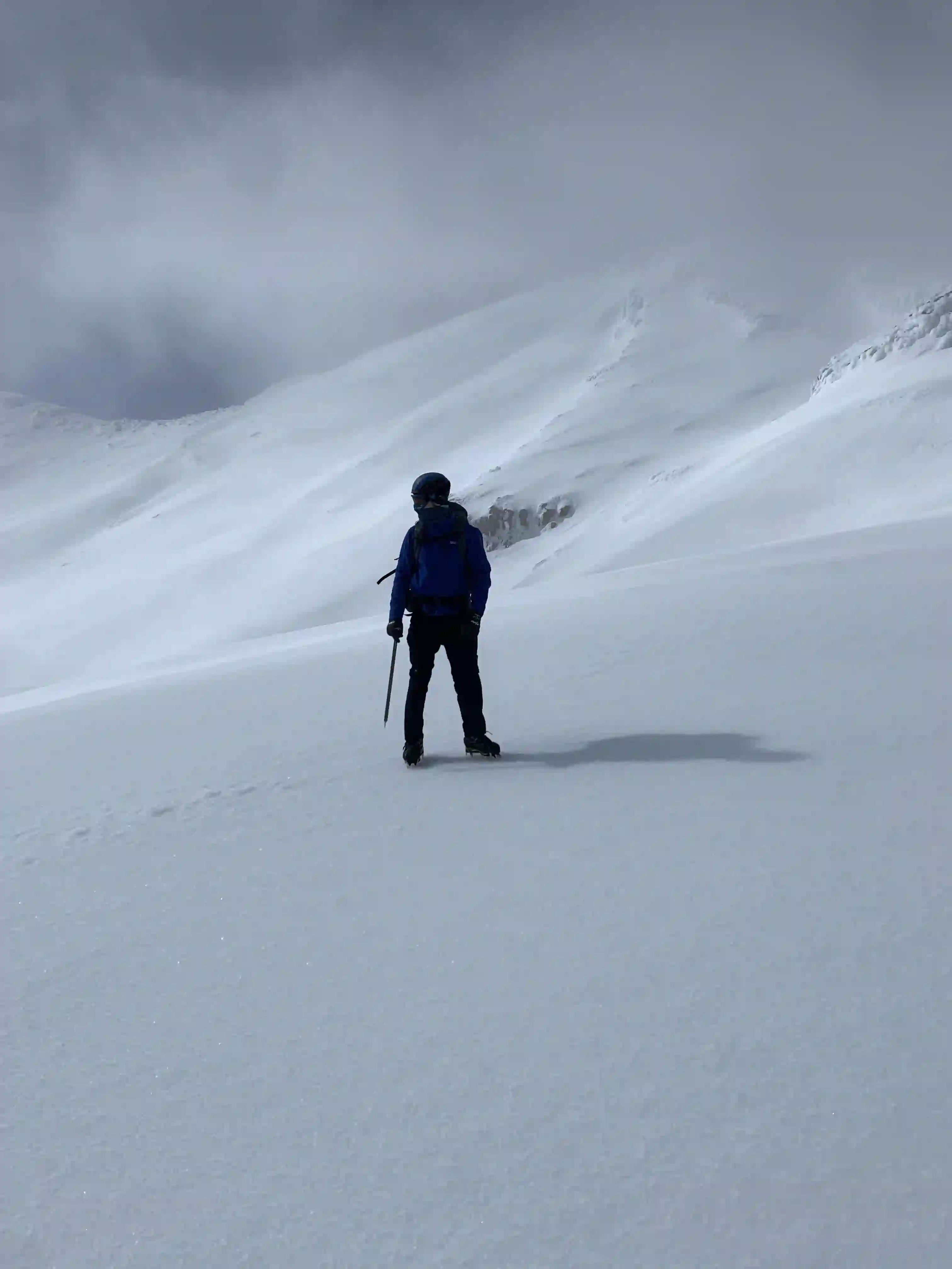
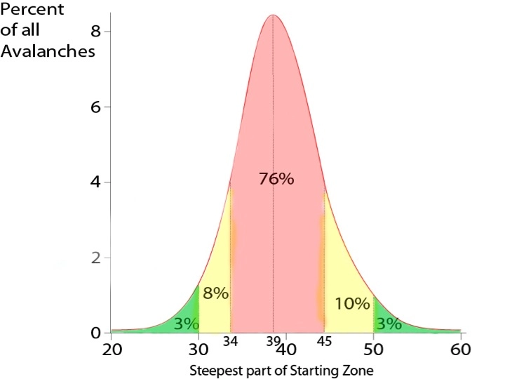
One of the biggest mountaineering hazards are avalanches. It’s somewhat funny because when I was growing up I kind-of had this thought that avalanches were big soft waves of pillowy snow that playfully tumbles you down the mountain to safety. That is not the case. They are incredibly dangerous, inescapable, torrents of suffocating ice that drag your helpless body over rocks and cliffs, often to your demise. When learning about avalanche safety and avoidance, we were taught about markers to look for and factors that played into their likelihood. My instructor gave us a rule of thumb: avalanches primarily occur on slope gradients between 30 and 50 degrees. We were taught to test gradient using the spirit level app on our phones to get a feel for it. Based on the following figure which draws data from a Swiss dataset of over 1000 avalanches, you can see that 96% of avalanches released on slope angles between 30 and 50 degrees (Image credit: Utah Avalanche Centre)
During the course we covered route planning and navigation using map and compass. I am a big map guy, i love a good map. NZ has these great maps called TOPO50, after them being topographic and utilising a 1:50,000 scale factor. They are free (paper copies are very cheap), accurate, continually updated, and frankly, beautiful.
Check them out here!
During the course I couldn’t help but think: Why not use the known elevation (all TOPO50 maps have contour lines based on elevation) to calculate a slope gradient and then highlight all areas that fall between 30 and 50 degrees as danger zones?
So when I returned from my brief frolic in the snow I did some digging. I found that New Zealand has a whole bunch of amazing land information datasets for free! I feel like for people in the land, data or land-data industry, this may not come as a surprise, but I thought this would be pay to play at the very least.
Within the datasets, I found what I was after: a DEM (digital elevation map) dataset for the whole of New Zealand. The data set was set at 8 m intervals, which i thought would be good enough to start with. The portal allows you to download specific regions of the data, and even better, they allow you to download a region of data that corresponds to a specific TOPO50 map!
I decided to look at the Mt Ruapehu region map as my testing subject, as that was the mountain I had just been on - Region code BJ34.
I downloaded the corresponding DEM data for the region and started having a look. The DEM data comes in the form of two seperate .tif / GeoTiff files, meaning they have embedded data giving coordinates and other interesting things like projection used etc.
The script to process the data was fairly straightforward:
- Reads and stitches the DEMs together.
- Calculates slope from elevation data.
- Identifies steep areas (e.g. 25-55°) likely to pose avalanche risk.
- Filters small or isolated regions or joins them together to focus on meaningful avalanche zones.
- Overlays the risky areas on the topographic map for visualisation.
After a first pass, it kinda works? At least it looks like it works, until you look a bit closer and you can see an offset between the calculated risk map and the Topo map underneath (red blotches are the risk map).
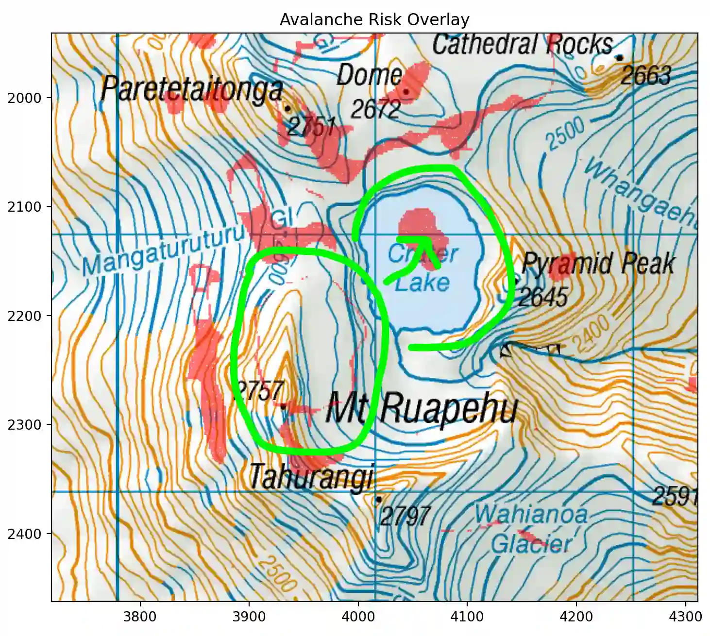
This stumped me for a while. After trying a few different failed attempts to massage the two maps into alignment, I found my problem after digging into the metadata with:
gdalinfo BJ34_GeoTifv1-06.tif
Their coordinates didn’t align!
Combined DEM:
Upper Left  ( 1803056.000, 5658664.000) (175d21' 5.04"E, 39d11'51.26"S)
Upper Right ( 1829064.000, 5658664.000) (175d39' 8.24"E, 39d11'27.99"S)
Lower Left  ( 1803056.000, 5621328.000) (175d21'45.74"E, 39d32' 1.37"S)
Lower Right ( 1829064.000, 5621328.000) (175d39'54.14"E, 39d31'37.82"S)

Topo map:
Upper Left  ( 1803997.883, 5658002.117) (175d21'44.99"E, 39d12'11.92"S)
Lower Left  ( 1803997.883, 5621997.617) (175d22'24.43"E, 39d31'38.87"S)
Upper Right ( 1828005.117, 5658002.117) (175d38'24.95"E, 39d11'50.44"S)
Lower Right ( 1828005.117, 5621997.617) (175d39' 9.01"E, 39d31'17.14"S)
Comparing the coordinate points you can see that the Topo data is a subset lying entirely inside the combined DEM data. Great - that allows me to just clip the DEM data to the Topo boundary to fix the overlay offset problem. Nice! Looks like things are aligning much better now.
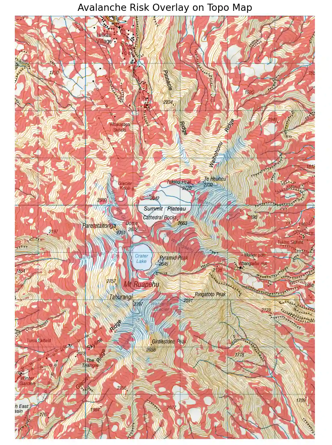
You can pretty quickly see from this analysis that the mountain is essentially one big danger zone, which seems heavy handed. I wanted to try and refine this and give a bit more context to the user. Based on the figure above, 39 degrees seems to be the riskiest slope angle. So i tried to apply a colour map so the risk could be interpreted a bit better, rather than just having huge no-go zones.
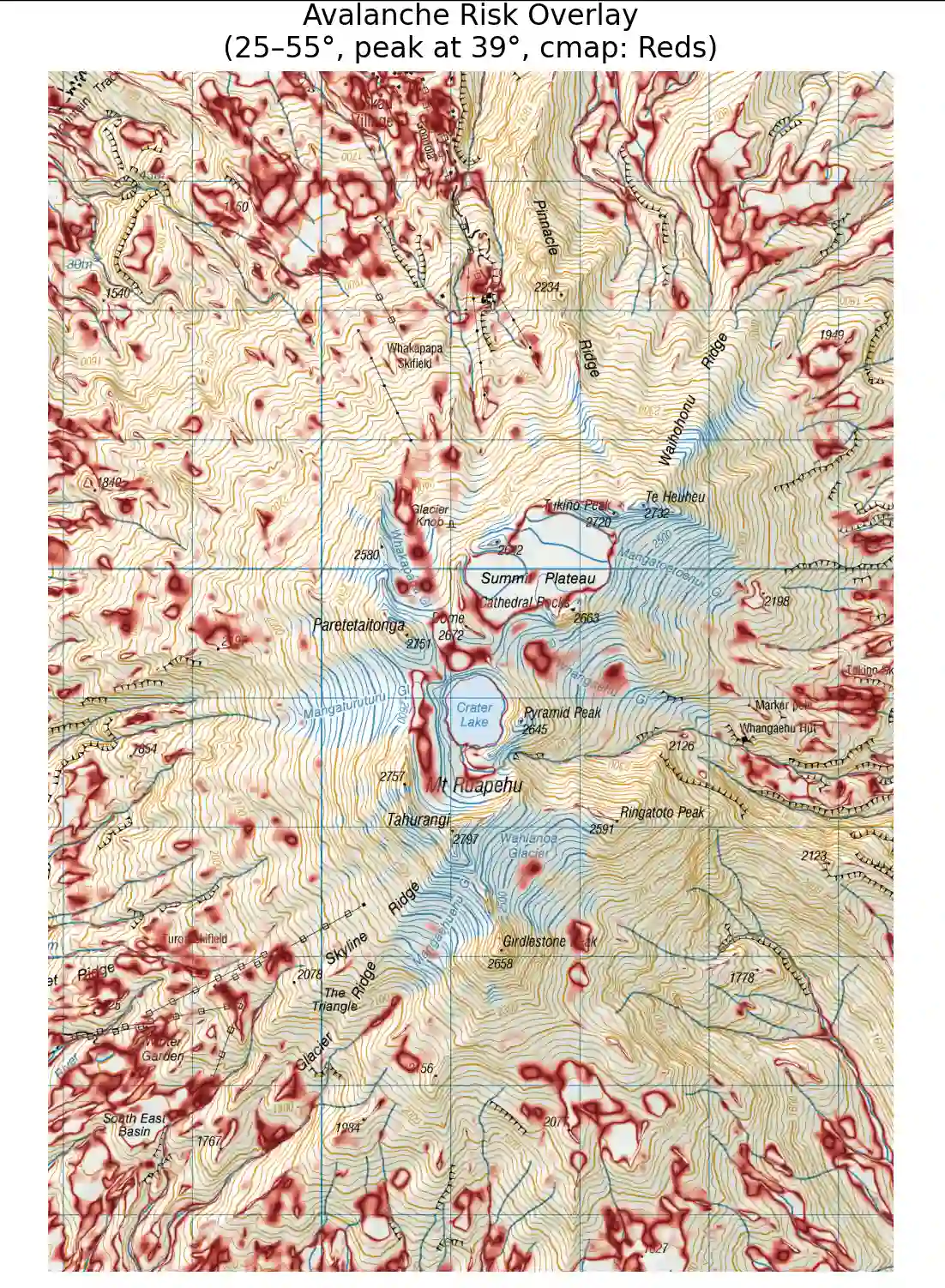
This was good and bad. The good - It removed the feeling of severity on the no-go areas and replaced them with what looks like “caution areas”, it looks better the further you zoom in. The bad - it looks messy and harder to interpret.
So i tried quantising into slope into bands:
25-35° - yellow
35-45° - red
45-55° - blue
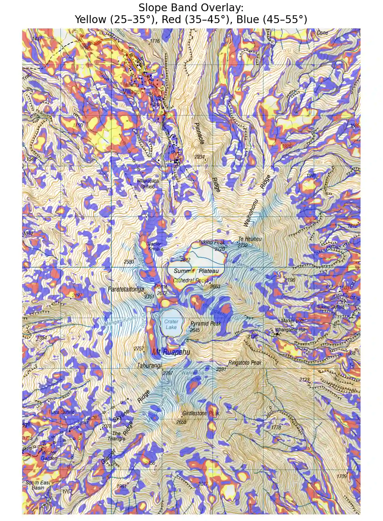
I think i like this more. It maps risk and gives context to the risk.
Thoughts and further development:
I think it would be good to add some features that are more context aware such as:
- A “danger region” on shallower slopes that are under large, high risk regions would be a great feature to add.
- Snow regions are an obvious one - bound the analysis to regions that are elevated enough to get snow in the first place.
I didn’t want to forge too far along this path as the data quality i’m using is not great. After re-reading the blurb that accompanied the data it says:
Suitable for cartographic visualisation only. It was created by the interpolation of 20m contours with post-processing and filtering it is not suitable for terrain analysis.
I see that LINZ is currently publishing 1 m lidar DEM data, which is something I would be interesting in revisiting once available. I think in its current state this tool is actually kind-of useful, the original goal was just explore the data and see if it could be done. When I talked to my brother (very talented surveyor) and friends about this, they recommended a GIS software. I did download a GIS software (freeGIS I think) but I was quickly turned away by the daunting, unintuitive GUI. I’m glad I did look past the GIS software, I think I gained a better understanding of the data at the end of the day!
